Industrial logos are all around us. Every day, these logos impact us somehow, whether it’s when we drive down a busy street and are surrounded by company and business identities or when we surf the Internet, viewing various industrial websites or advertisements.
By definition, a logo is a symbol or other design adopted by an organization to identify its products, uniforms, vehicles, etc. But in today’s fast paced, high-tech world, a logo does so much more.
I would argue that a logo is the single most important part of a company or brand. Why?
Well, according to this infographic, the average consumer has an attention span of 8 seconds when it comes to viewing webpages. That means a company has very little time to capture a customer’s attention. That’s not a lot of time!
However, industrial logos — as a form of shorthand for identifying a company — are uniquely positioned to take advantage of this opportunity. To make the most of this limited window, a logo should not only look appealing, it should encompass a company’s entire essence. A company’s name, identity, and even its work environment can be communicated through this single graphic element.
So, how do you make a great industrial logo, you ask? While anyone with knowledge of the Adobe Suite can take a crack at it, there are a few solid guidelines that will produce an effective logo time and time again. But be warned — really implementing these criteria will take time, focus, and talent!
- Simple – A simply designed logo allows for easy recognition. Take the KISS principle to heart when designing industrial logos: Keep It Simple, Stupid. (No, I’m not calling you stupid. KISS is a method that contends that logos perform better when they feature a simple design rather than a complex one.)
- Memorable – Remember how consumers have a shorter attention span than a goldfish? This element goes hand in hand with simplicity in that a logo has to capture a consumer’s attention and make a lasting impression. How often do you remember sub-par industrial logos? Probably not as often as you remember the really, really good ones (or the really, really bad ones).
- Timeless – A logo should be able to endure the ages. Simple as that.
- Versatile – You may or may not realize it, but industrial logos can have many different uses. The logo you see on the side of a building may not be the same version that you see on a company’s letterhead. Logos must be flexible so they can be utilized in many different formats. This kind of versatility can involve size and scalability, color vs. black and white, or being reversed out on a colored background.
- Unique – Do you really want your industrial logo to look like your competitor’s? Didn’t think so.
- Intentional – Every aspect of your logo should be carefully thought out, from color choice to typeface. Brainstorming sessions, research, and mindmaps can all help you land on a great, thoughtful industrial logo.
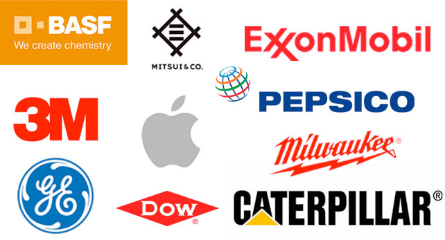
To illustrate how these principles can be applied to create great logos, here is our list of the ten best industrial logos.
3M
Minnesota Mining and Manufacturing, better known as 3M, is the poster child for a simple logo. Since its logo first appeared in 1906, it has undergone very little design change. The current logo has been around since the 1970s and is a great example of simplicity and timelessness.
Pepsico
The global food and beverage manufacturer produces so much more than the soda. The thoughtful choice in coloring makes this logo bold yet inviting.
Dow
Another excellent example of a timeless logo featuring bold, red-and-white coloring and a simple company name, Dow’s logo has been around since 1897.
General Electric
General Electric got its start in 1892, and since then its logo has changed very little. The hand-drawn look of GE has lasted over a century. Talk about timeless!
Apple
Since 1976, this apple with a bite taken out of it has represented a technological company that has changed lives. Simple, memorable, timeless, unique, intentional . . . you name it. Read more about the famous Apple logo here.
Caterpillar
This industrial logo is a great example of one that communicates emotion, all with just two simple colors. The yellow color in the logo represents joy and optimism while the black color stands for excellence and power. Pretty spot on for a machinery manufacturer, don’t you think?
BASF
This German-based chemical producer provides a great example of a versatile logo. While their original logo is white text on a gold background, the company provides many other options for use of its logo. For example, the BASF branch in the United States uses a logo with white text on a blue background.
ExxonMobil
This logo has an intentional meaning that you may not even realize. The two X’s in Exxon were crossed in an effort to symbolize their reliability.
Milwaukee Tool
This company has, without a doubt, a unique logo. The combination of a striking typeface underlined by a lightning bolt makes this tool company hard to forget.
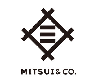
Mitsui & Co.
This black-and-white logo is the epitome of simplicity. Founded in Japan in 1876, this automobile manufacturer has offices all over the world but clearly conveys its historical roots with its logo’s homage to Japanese lettering.
Industrial Logos Are Just the Beginning
It doesn’t stop there, folks. Along with a strong logo, a company must also pay close attention to many other aspects of a brand. On the surface, other things to consider are taglines and slogans. Digging deeper, one needs to think about the tone of one’s messaging, a compelling mission statement, branding consistency and, most importantly, a strong and genuine connection to one’s customers.
If you don’t have your customers’ trust, you have very little. When all is said and done, having a solid industrial brand — of which your logo is just a part — is about leaving a lasting impression.

