Take a deep breath. Do you feel that? That’s breathing room. That’s whitespace and organization. That’s the new Industrial Marketer. And I’m Beth Joseph, the designer responsible for the new look and feel you’re experiencing.
Thanks for visiting our site. I wanted to take this opportunity to tell you a little bit about how we got here, discuss the importance of branding, and elaborate on why we took Industrial Marketer in this new direction — which is really an expression and evolution of the publication’s deeper historical mission.
Since 2003, Industrial Marketer has been the online publication where business leaders in the industrial sector learn about the ways marketing can improve their businesses, and where marketers engage with the challenges that are specific to industrial B2B. As our founder James Soto has said, “Industrial Marketer is a collection of news, reviews, information, technology, tips, and trends for and by industrial marketers.”
We’ve always thought of this publication as a forum where readers involved in industrial marketing come to learn about the field, challenge assumptions, and envision the future.
“News, reviews, information, technology, tips and trends for and by industrial marketers.” — James Soto, Founder, CEO, Industrial Strength Marketing
However, it became clear that the look of the site — and on a larger scale, the brand in general — didn’t match its aspirations. It was time for us to step it up. It was time to give Industrial Marketer the facelift it needed, so that it didn’t just say what it was about, but rather it started to be what it was about.
Why Rebrand Industrial Marketer?
Industrial Marketer’s original site design (we confess, an off-the-shelf WordPress theme) had several issues. For one, the page was cluttered and confused. There was no clear hierarchy of elements, and most of the content was getting lost. We wanted to come up with a solution that would let each article shine.
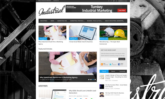
The old Industrial Marketer faced some design (and brand) challenges.
Second, there were no clear brand standards in place. Article images felt drastically different from each other, to the point that it often seemed as if they weren’t from the same source. The site needed visual standardization and organization.
Rebranding is More Than Just a Redesign
While Industrial Marketer certainly needed a redesign, it also needed more than that —a strong foundation on which to build the site. We decided to dive deep and take the time necessary for a quality rebranding exercise.
When most people think of a brand, they think of a logo. In the case of a publication, this is often synonymous with the masthead, which is where I began. Drawing inspiration from antique manufacturing aesthetics, I began making sketches of what the new Industrial Marketer logo might look like.
I believe sketching by hand first is important — it’s liberating and fast and you usually find solutions you wouldn’t have on the computer.
I wanted the mark to be reminiscent of the heyday of American manufacturing, so I began gathering inspiration from the logos and boilerplates of the factories and plants that once carpeted the American landscape in the ’40s and ’50s. I started to experiment with juxtaposing strong, bold typography with the script lettering that was popular during the era. From these initial sketches, I moved to the computer and began developing some digital logos.

This is a very small sample of early versions of the Industrial Marketer logo; I have a giant file full of about 100 versions.
After combing through all the iterations, the mark began to take shape. Once I narrowed the selection down to three or four, it was time for color. I decided on a palette of cool, concrete grays with a pop of safety orange to give the brand an industrial, professional, and approachable feel. I also added a light blue to be used occasionally and very sparingly to create a burst of bright color to grab visitors’ attention.

The Industrial Marketer color palette. Color is vital in branding, and I believe this palette truly captures the “industrial meets digital” feel of the brand.
After several meetings and much deliberation, primary and secondary marks were chosen.
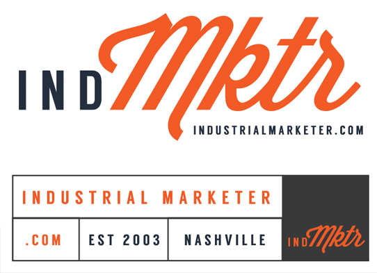
The new marks that represent Industrial Marketer.
Juxtaposing the typography that reigned during the industrious 1940s and the abbreviated nature of today’s Internet culture, the primary mark (top) creates a meaningful bridge between the past and the future. The secondary mark (bottom) expands on this as it is modeled directly after machine plaques.
The rest of the Industrial Marketer team and I felt like both of these marks captured the very essence of what the site is about, and are excited to explore ways to implement them both.
The last piece to the branding puzzle was the typography. I was careful to choose Google fonts to ensure that all of our visitors would have the most beautiful experience. Bitter, a bold slab serif, was chosen as the headline font. Strong and proud and unapologetic, Bitter embodies our sentiment toward marketing for industrials. For our body copy, I chose Open Sans, a very clean font that is pleasant to read, in order to give our articles a friendly and approachable yet professional feel.
Building on the Foundation
With the new mark established as our foundation and our colors and fonts selected, the rest of the team and I began the daunting task of redesigning the Industrial Marketer website.
We knew the site needed to be clean and well organized, so I set out to create a user experience that would be direct, enjoyable, and fulfilling. We also wanted to make sure to build a responsive site. However, I adopted a very traditional approach to wireframing and design during the project. That is, I created desktop wireframes that led into desktop visual comps, and from there began designing the experience for mobile.
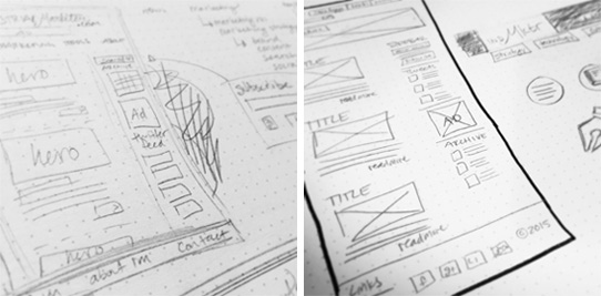
I prefer to do my wireframes by hand because I can sketch out ideas faster and more fluidly.
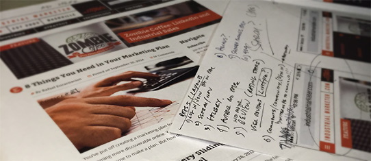
Sketches and wireframes led to Photoshop mockups, which led to many print-outs, meetings, notes, and revisions to make sure we had every detail of the experience just the way we wanted it. Including lots of open white space and a clear hierarchy of content were paramount to this new flow.
We also made sure to institute a set of standards for our article images. A subtle background texture was included to make the site cohesive through its open spaces. The brand colors were introduced in meaningful and purposeful ways, and the user experience throughout the site was carefully considered.
Feedback from your team is incredibly important when working through a design process. A fresh set of eyes and input from trusted sources are always welcome.
After many rounds of tweaking, we came to the current design: a carefully considered blog format that encourages exploration and engagement with our content.
Brian Matthews, Industrial Marketer’s lead developer, rebuilt the site from scratch, optimizing it for usability and exceptional load times. After weeks of testing for bugs and squashing them, we launched. And here we are!

The beautiful new site in all its glory!
Time to Explore
Thanks for visiting. We invite you to come experience the site we lovingly crafted in more depth. There are lots of old but good articles here that are now much easier to find and enjoy.
We also hope that you’ll return regularly to see how things evolve. With our rebranding, we aim to publish more often, and to reassert our original mission. As you may have inferred, we find the industrial world an endlessly interesting space, both conceptually and creatively. “Industrial,” we affirm, is not something to be kept hidden, but rather shown and celebrated.
In short, engaging our audience in current conversations happening in industrial advertising, marketing, and technology is and has always been our passion. And we are thrilled to pursue it with a new, sharper, cleaner look. So please explore, enjoy, and let us know what you think!